Going for "Beautiful"
This is an excerpt from the Book called “Yards” by Billy Goodnick. Continue reading to learn more about Pretty,pretty going forward for “Beautiful”, thanks to the author.
Now that you’ve disposed of all the plants that won’t serve your needs and have no business in your yard, it’s time to round up the survivors and make something beautiful.
Harmony and Contrast
There are entire books written about aesthetics and design, but if had to pick one concept for all gardeners to understand, it would be the interplay of harmony and contrast, which are opposite sides of the same coin. The terms refer to how alike or different things are from each other. When I design, these are the first tools I pick up for generating visual interest.
In a yard that takes a mostly harmonious design approach, elements tend to blend well, with no lead performers, nothing yelling, “Hey, look at me|” Harmony applies to the forms, colors, textures, and other visual characteristics of plants or materials. For example, an analogous color scheme (described in the chapter) is all about harmony and might incorporate earth-toned brick paths, natural wood furnishings, terracotta containers, and bronzy foliage accents. Applying this principle at a finer level, you could try using the same local stone in various forms, like gravel, boulders, and cut blocks. Because they all come from the same source, they’ll share the same color and pattering, tying different parts of the garden together.
Floral Flamboyance
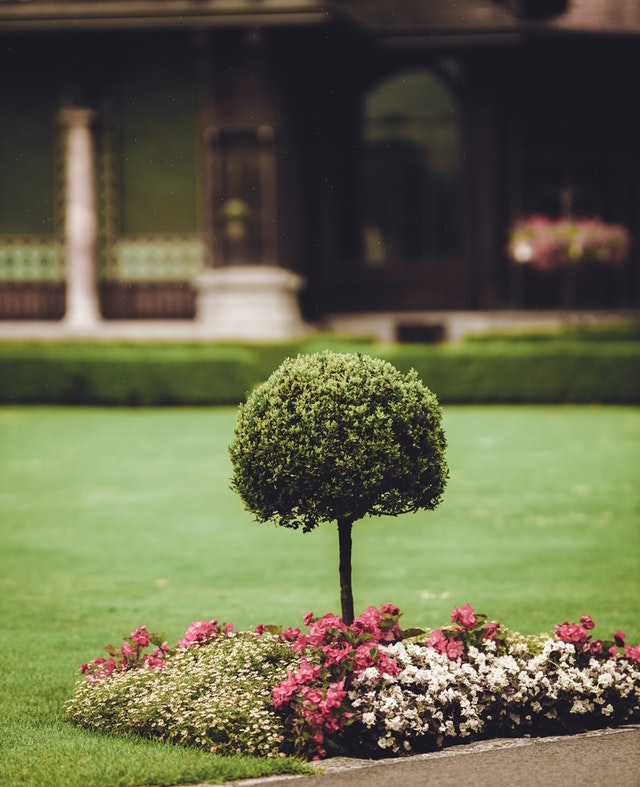
When it comes right down to it, it’s flowers that make a garden glow. Our brains are wired for color, a development essential for proto-humans to spot ripe fruit in a tree canopy, or knowing which team to root for in the Neanderthal vs. Australopithecus Olympics. We don’t have 6 million cone cells in each eye for nuthin’.
Flowers wake up a garden. And they’re sexy, literally. All those petals, stamens, pistils and ovaries aren’t just for show; they’re how plants reproduce. Their shape, location on the plants, and color determine who pollinates them (birds or bees or butterflies or beetles; wind, too).
Although the plant could care less, one of our main concerns when deciding which flowers to add to our garden boils down to human superficiality: Is it a hottie?
Picking your posies
Stylin’: Look for examples of the style garden you’re designing- Old World, tropical, urban- and notice how floral color is handled. Are flowers the dominant feature or are they applied with a subtle hand? Does the design use just a few crayons from the box, or is it Jackson Pollack’s controlled madness?
The color scheme for a woodland garden should be more muted than a sunny border of a cottage garden, since we’re trying to capture the quiet and calm of a forest floor. In desert gardens, flowers are often short-lived, but maximize their likelihood of reproducing by sporting brilliant, neon colors.
Context: Take note of what’s surrounding your garden, on your neighbor’s property or in a distant vista. A garden that responds to the context around it benefits from “borrowing” colors and forms from the scenery to extend its visual limits.
It’s not always necessary to blend in with the surroundings. Unlike a garden with vistas to dramatic mountains, a garden in the midst of about-up environment can assume virtually any style without contradicting its context. The key thing is to make a conscious decision whether to embrace what’s already there, or knowingly contradict it.
Closer to home, literally, context means considering the colors and materials of your exterior house walls. Too often, even someone with a good grasp of color theory succumbs to tunnel vision. As if picking swatches at the local paint store, instead of plants, they succeed in developing a palette of colors that, standing alone, would be attractive. But if they haven’t paid attention to the finishes of the house, paving materials, furnishings, or fence, the result could make even a colorblind beagle bury her head in the compost pile.
Color in the garden does not exist in a vacuum-one of your design objectives is to be able to say, “Yes, I meant to do that.”
Your color scheme for plants and everything else in your yard should coordinate with house, paving materials, fences and furnishings. I’ve seen beautifully conceived warm color schemes planted next to a building dominated by cool, blue-gray siding, a design decision that had a jarring effect on the big picture.
Plant form: One more pug for paying attention to more than just the color of the flower petals. Even though our attention is usually on the actual hue of the petals, all the other characteristics of a plant come into play. It’s fine to decide you want a splash of bright yellow in the garden. Your final choice shouldn’t stop there. Will the color come from a slice of yellow flag (Iris pseudoacorus), with its slender, vertical architecture, a mound of cloud- like forsythia, or a low, buttery spread of pansies? As long as you’re picking plants, you might as well exploit as many visible features as possible.
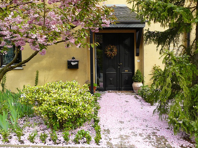
Seasonal Changes: As you consider plants for your palette, don’t just focus on the appearance at peak bloom. Most plants transform throughout the season, like the way rose blossoms mature into fiery red hips, adding a new dimension to the garden in fall.
Consider how the plant’s foliage complements or contrasts with the blossoms. One plant that stymies me (so I don’t use it) is Brazilian Sky flower, a great screening shrub that blooms, as you would imagine, with sky-blue flowers. It would make a fine backdrop for other plants in the purple to lavender range. But later in the year, the flowers ripen into the clusters of tiny orange berries. So do you use it as a cool color addition in spring, but allow for it to transform to the warm component of the bed later in the season? This metamorphosis can change a garden’s appearance from month to month, which is what makes garden design so exciting and sometimes perplexing.
Timing is everything. Like with airlines, life would be much easier if flowers had reliable schedules. Wouldn’t it be cool if plant labels said: “Flowers appear June 7 at3:30 p.m., ceasing on July 4, right after the fireworks finish and all your guests leave.” Then you could create reliable color combos that match the seasonal table settings on your patio. Do your research and try to find out when each plant is most likely to bloom, and you’ll have a great show. You might want to revisit Chapter 7’s discussion of the four- season garden.
Color Scheme categories
Monochromatic refers to a palette of flowers and foliage within a narrow range, such as the pink-red-maroon mix discussed. You can pick any point on the color wheel and spread out a little in each direction, including adjacent hues, plus tint and shade variations. These simple schemes lend themselves to small gardens, since they’re easy on the eye. Tip: Tossing in white or gray enriches the range without adding competition.
Analogous color schemes expand on the simplicity of a monochromatic approach but broaden the look, using colors adjacent to each other on the color wheel. One of the most sensuous combinations I use starts with violet-a calming, dreamy hue-and pushes the palette over to red, bringing heat and passion to the mix. If I want to cheer the picture up, I’ll include lavender and pink tints, or impose a more somber effect with deep shades of burgundy and purple. Using analogous colors makes for more visual interest but still plays it safe by grabbing from a narrow range.
Of course, the same principal works with warm colors. Yellow and orange are close neighbors, which, when combined with their shades (gold and rust), heat up a focal point planting. Expand the palette by one more “Wedge” to red, and you’ve added more BTUs to the burner.
Complementary Schemes use polar opposites to generate high contrast. These combinations occur naturally in some plants, like the violet and yellow face of a Johnny-Jump-Up viola. Notice how purple, lavender (Purple’s tint) and the pure yellow hue seem to jump off the page. Remember our earlier discussion of balance?
This principle applies when you decide on the ratio of warm to cool in a two-part scheme. Note also how little yellow (the warm part of the equation) it takes to balance all the coolness.
The iconic Christmas green and red combo of holly leaves and berries is the epitome of high contrast, as is the fleeting combination of a monarch butterfly feeding on mountain lilac.
More contrast means more visual interest, excitement and drams, so I use this approach with restraint. Unless I’m trying to create a big, bold effect in a grand bed, I tend to limit my use of pure-hue contrasting combos to one or two key locations as focal points. You can continue to play with subtle contrast in adjacent areas, switching to subdued tints, or introducing more neutral colors.
Polychromatic means many colors. It can also translate to Look at All the Crayons My Grandma Gave Me. Are you from the “I just want a lot of color” school of thought? Do you find yourself bringing home any and every plant as long as they’re bright, then scattering them in the garden wherever there’s a blank patch of soil?
There’s a right way and a wrong way to handle multiple colors. The first is to keep scale and proportion in mind: A small garden can only support so many different plants and colors without resulting in optical anarchy. Strike a balance between saturated and less intense flowers, so their neighbors don’t overpower them. Create micro-communities of analogous colors, so each has a bit more impact. By integrating the same concepts of the more organized color schemes discussed earlier, you’ll be able to manage more variety without letting things get out of hand.